Problem:
The White Company had grown a successful business through their direct mail and physical stores. They've had grown a very loyal and almost 'cultish' customer base who are also digitally savvy.
They have a website that underwent a re-platform a few years ago, but they felt they needed to review the digital roadmap as there was an ever increasing demand for their digital offering by their return users as well as new users.
As a result, most of the website needed a redesign. Prioritising the most important areas that would provide the most value to customers - Checkout journey.
My role:
UI/UX Designer (UI heavy) - wire-framing, prototyping, A/B testing
Core team: Product Manager & Engineering
Wider team: Marketing, Creative and Multichannel
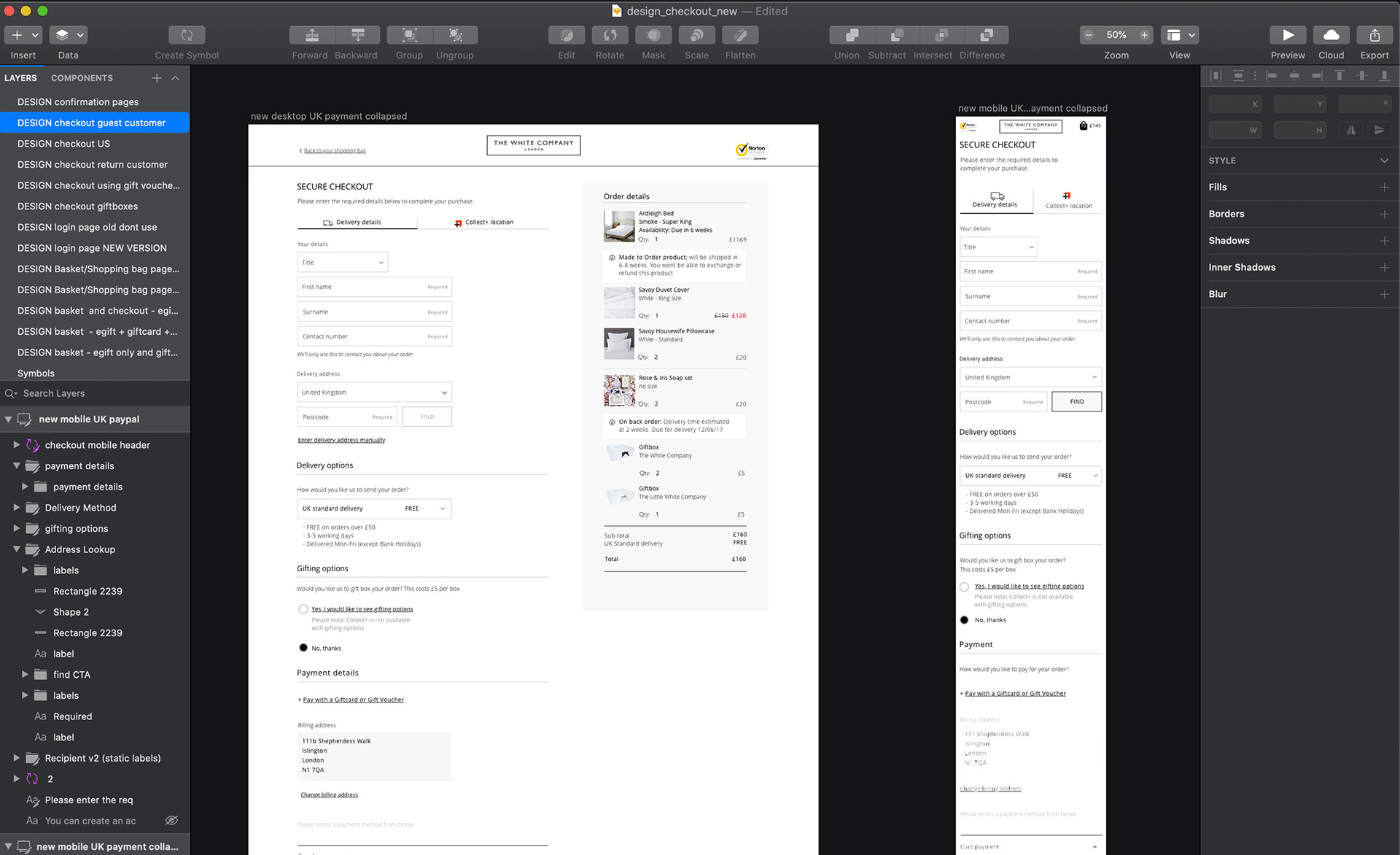
Secure checkout designs for both web and mobile
Challenge:
As e-commerce was still a relatively new area for them. The digital team was still in its infancy. This meant that I did not have access to a lot of testing - such as A/B testing and user testing to help us make informed design choices.
However, we used what data was available - such as our own competitor analysis/benchmarking, focus group information, customer reviews and ratings, heat maps to analyse scroll depth and metrics via Adobe Analytics.
Hypothesis:
By redesigning the check out flow as a 'mobile first' design, there will be an increase in conversion rates for both desktop and mobile. I also believe there will be an increase in mobile users and first time sign ups.
Including features in this redesign that would only be traditionally available in stores, would also see an increase in conversion rates. Features such as allowing the user to gift wrap items in their shopping basket.
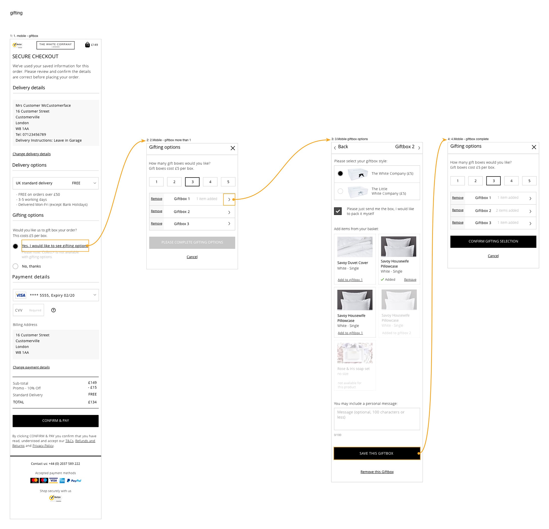
The gift box selection journey within checkout
Lessons learned so far:
The ability for users to access added features and new methods of payment via mobile has seen an increase in conversion rates. We have also seen a library of pain points from the new checkout that can be use to base iterations in the future. So far so good!